MyMoney -
Site Refresh
Compelling Content from Fidelity Investments.
Company: Fidelity Investments
Role: Product Design Lead
Challenge: how to attract our next generation of customers
Fidelity faced a challenge in 2013 as their primary customers were retiring and drawing on their retirement savings instead of contributing to it. They needed to attract the next largest segment of the population: millennials.
Overview
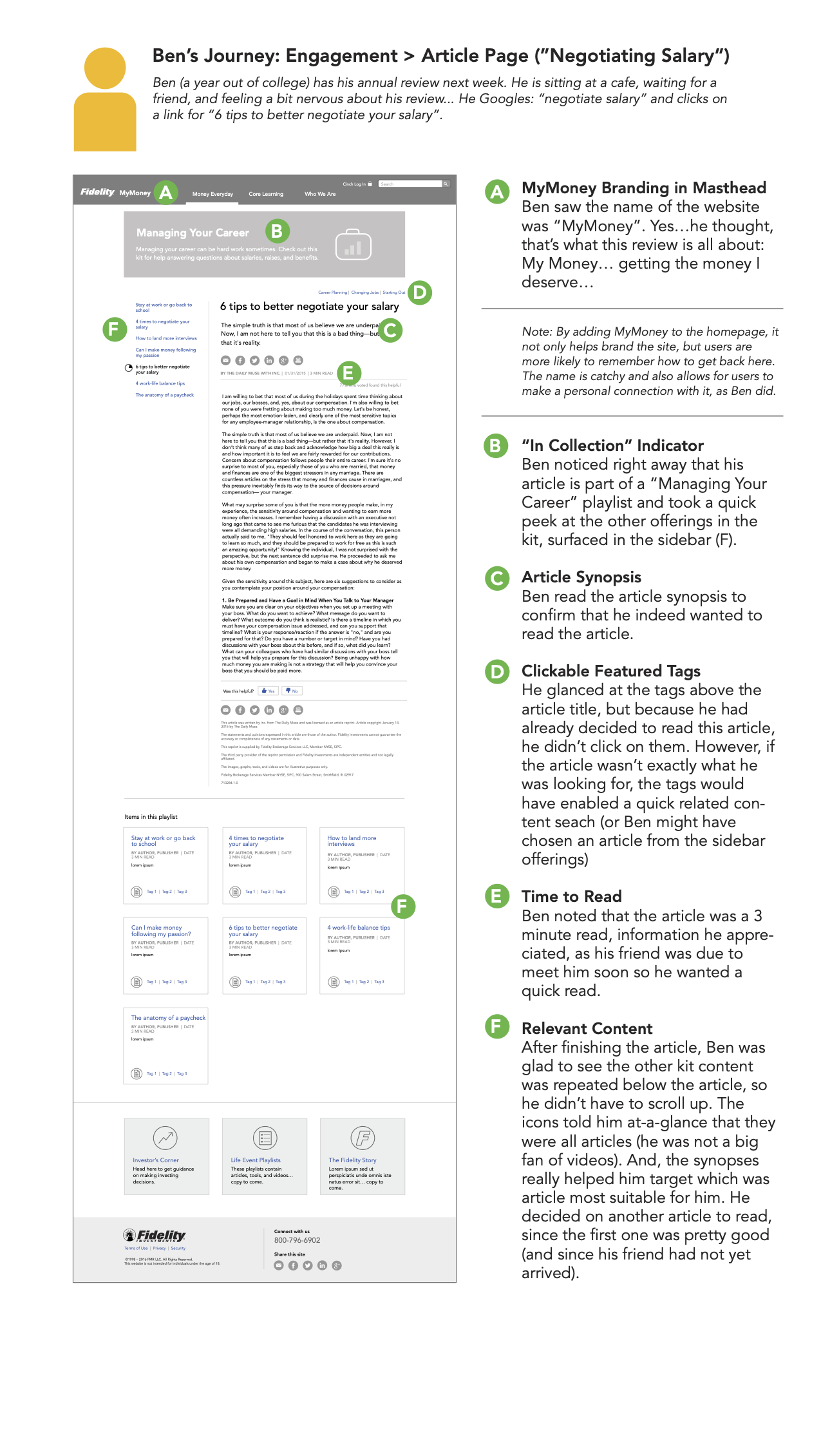
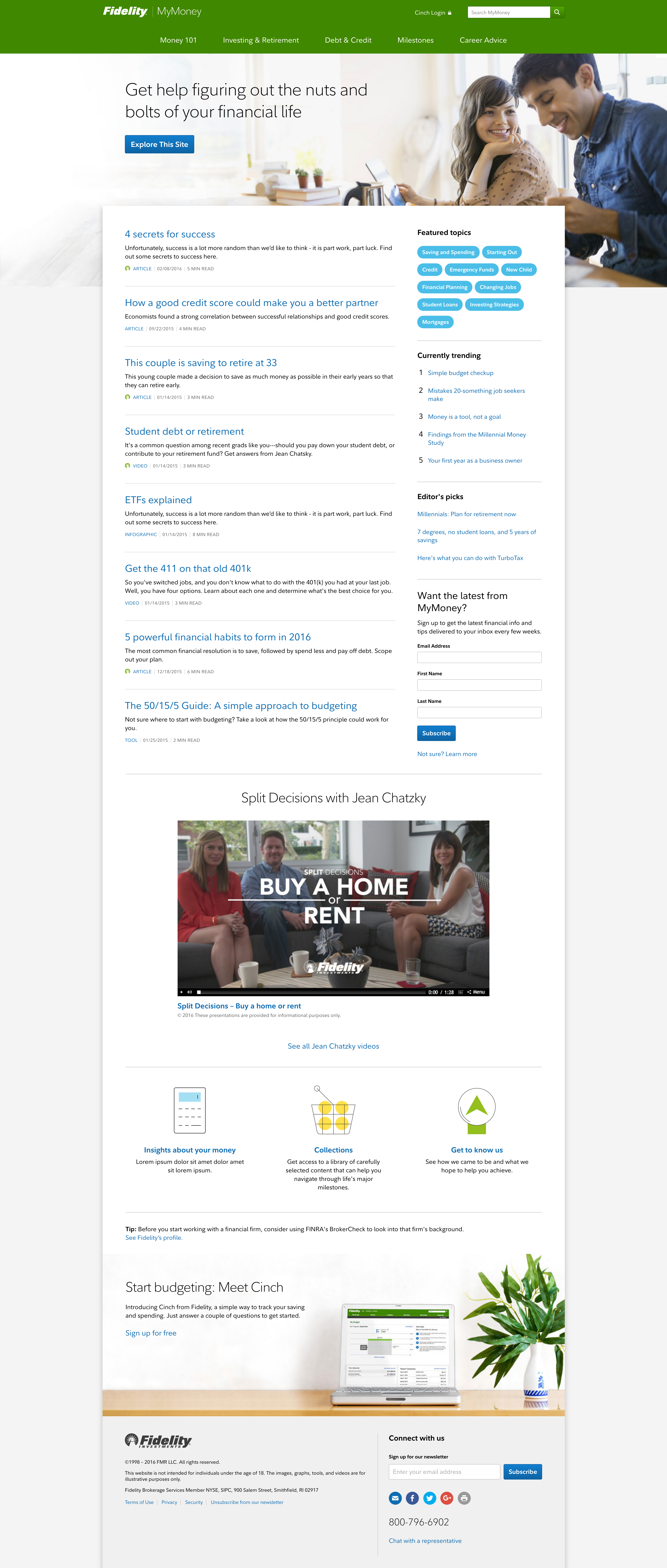
Fidelity aimed to engage Millennials through tailored tools and content on the MyMoney sub-site. Our team conducted an assessment of the existing site to identify areas for improvement, including information architecture, content pathing, and user engagement metrics. The redesign aimed to create a content-forward design, enhance navigation, and encourage exploration through various features.
Process
- Research: We conducted research studies based on user journeys to gain insights into Millennials' needs and preferences. This guided our design decisions and helped us understand the target audience better.
- Wireframing: Using the research findings, we sketched wireframes to visualize the proposed improvements. The wireframes focused on creating a content-forward design, improving the navigation system, and incorporating organic wayfinding techniques.
- Design Iterations: The wireframes were refined through multiple iterations, taking into account feedback from stakeholders and user testing. The final design showcased a content-forward approach, allowing users to easily discover relevant articles, videos, podcasts, and infographics.
Key Design Features
- Content-forward Design: The redesign emphasized compelling content and improved its presentation across various media formats.
- Enhanced Navigation: We organized the information architecture to accommodate the growing content volume and facilitate seamless navigation between related articles.
- Organic Wayfinding: Users were provided with clickable topics, suggested related content, and next best actions to encourage a more intuitive and engaging browsing experience.
- Alternate Data Presentation: To promote exploration, we introduced features such as estimated time-to-read, content type filtering, and prominent content synopses.
Results
The redesigned MyMoney sub-site offered a more user-friendly experience, resulting in increased engagement metrics, including longer time on site, improved social sharing, and higher account openings. The content-forward design and enhanced navigation successfully catered to Millennials' needs and fostered stronger relationships between Fidelity and its target audience.
Lessons Learned
Conducting thorough research and user testing at the beginning of the project would have provided valuable insights and potentially reduced the need for design revisions.
Collaboration between internal teams and stakeholders was crucial for gathering insights and ensuring the successful implementation of the redesigned sub-site.
Overall, the MyMoney sub-site redesign played a vital role in Fidelity's efforts to connect with Millennials, offering a seamless user experience and valuable financial resources.
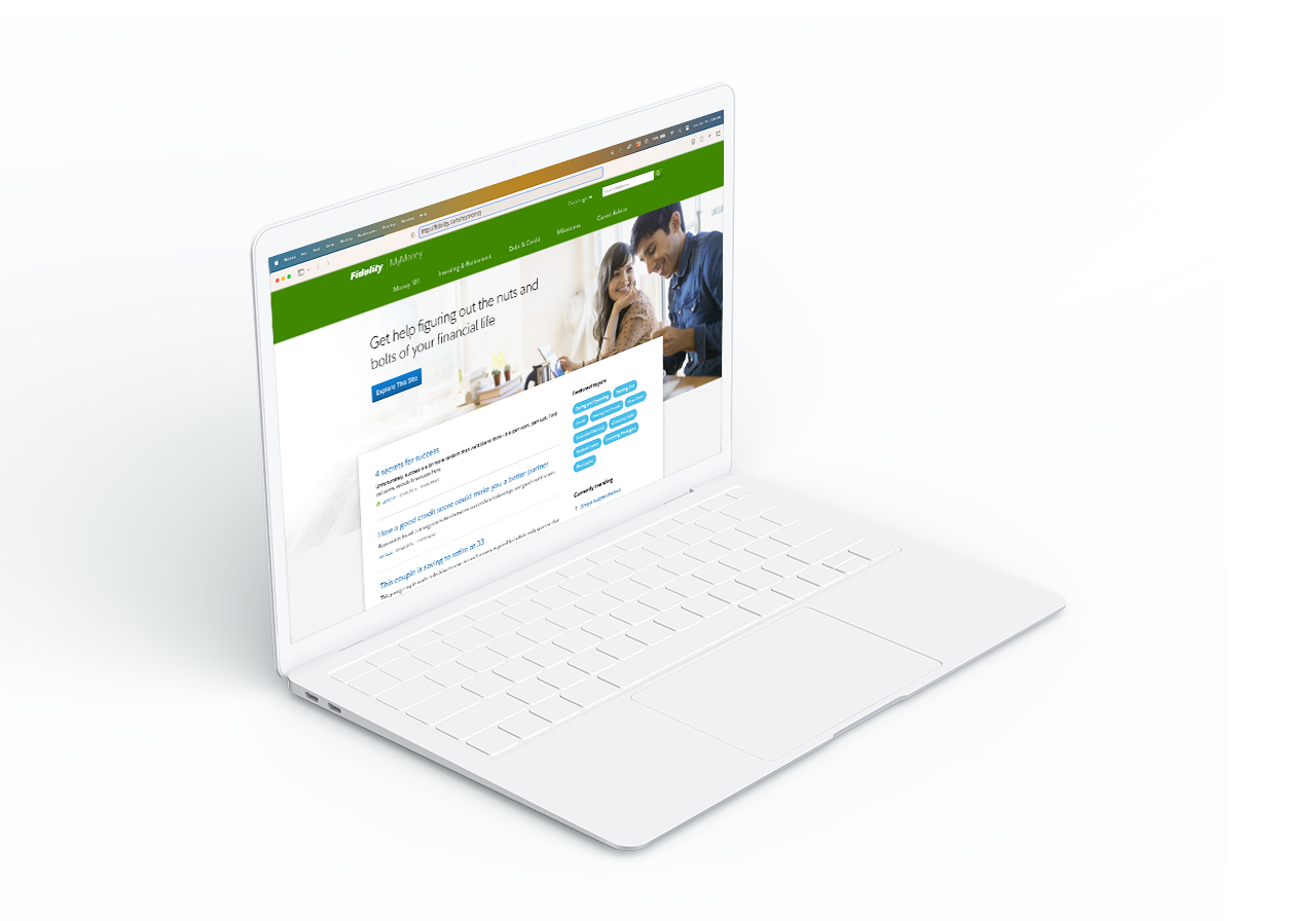
Drag the white bar horizontally to see the before & after results of this project.
Selected Works
CinchConsumer Finance : Product Design

MyMoney - Site Refresh - NewConsumer Finance / Strategy & Information Architecture
PlayforceNonprofit Community-driven Website / Information Architecture
Copyright ©2023, All rights reserved.